Just my type
ego-trips meta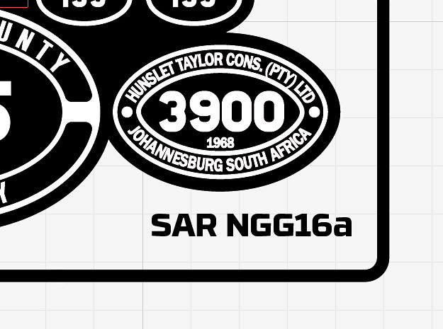
Yes, a self-indulgent blog post about typography. Please excuse me.
While I am not in any way, shape or form a graphic designer I do enjoy good design and typography, and have deliberately kept the design work on the Narrow Planet site and packaging as minimal as possible to avoid over-cluttering it. The typography though, we went through literally hundreds of fonts before settling on Interno for the logo, as it seemed to represent well the act of folding metal from an etch into something 3D. (I did warn about the self-indulgence. Sorry.)
The other main typeface up to now has been Eurostile, used for information on frets because frankly Interno isn’t brilliantly readable. It’s pretty safe choice, clear and modern, but it gets around a lot. So I’ve been looking out for something different and today found RBNo3.1, which aside from having a brilliant name is also a really nice, technical-looking sans serif. That’s what you can see above on the NGG16 artwork, and what you’ll be getting from now on on Narrow Planet etches.
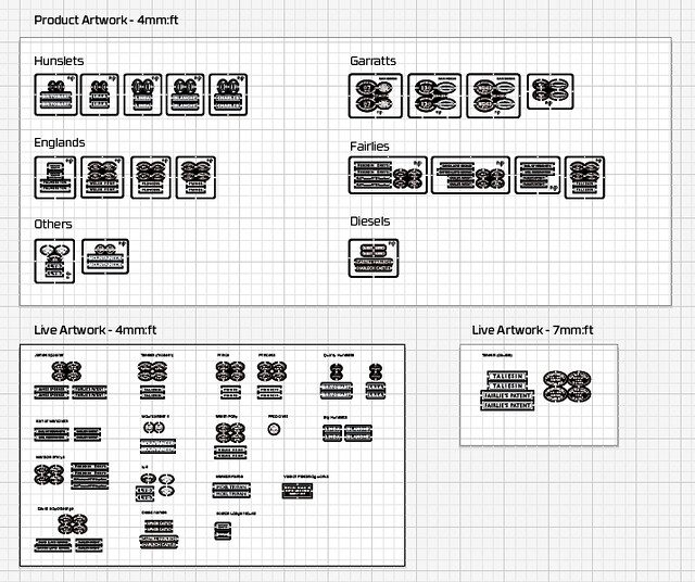
While I’m at it I thought I’d also show how artwork gets organised, as since day one of doing this I’ve followed the “don’t throw anything away” principle. That means that anything which has been produced before can be produced again, and I have a growing collection of Illustrator files with all the templates in. In the example above the ‘product artwork’ is finished, ready-to-etch items with all the type converted to outlines (you have to do this before the photo tool is created but it means you can’t change the text any more) while the ‘live artwork’ still has editable text. This makes for a library of designs that can be adapted and modified on request, which is the whole rationale of the service.
And on a final type note, the Narrow Planet website uses Transport Bold for its headings, which I liked visually but the relevance of the name certainly clinched it.
- Previous: Prints of darkness
- Next: Nearly there